


Building Pages in the Media Center
The Page Builder is a fully customizable tool for building and managing pages within your Media Center.
Discover components or jump to a specific section
Basic


Media
Automatic
Introduction
-

What Is the Page Builder?
The Page Builder is a fully customizable tool for building and managing pages within your Media Center.
With full control over both layout and content, you can easily create dynamic, branded pages that suit your specific needs. Add or remove sections at any time using a wide range of flexible components.
-

Fully integrated
Page Builder is tightly integrated with the rest of the Clipsource platform. That means you can pull in content and media from other parts of the system — either manually or automatically. Use:
- Press releases and posts from the Media Center
- Videos and metadata from your Program Catalog
- Assets from the Media Bank
This integration makes it faster and easier to build and maintain your pages.
-

Component-based Content
The Page Builder is built around drag & drop components. Each block on your page — whether it’s a text section, image, file, or automatic content feed — is a component you can add, configure, and reorder. You decide what to show and how it should appear.
We’re continuously adding new components, so this guide will be updated regularly. Have ideas or requests? Let us know at support@clipsource.com.
-

What This Guide Covers
This guide walks you through how to use the Page Builder in the Clipsource Media Center, including:
- Constantly updated with new components
- All available components & how they work, with examples
- How to structure your pages effectively
- Tips & best practices
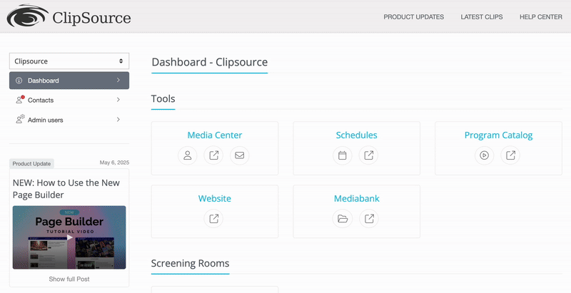
Accessing the Page Builder
To create or edit a page:
Go to the Media Center.
Click “Pages” under the left menu.
Hit “Create new page” to launch the Page Builder.
The Page Builder Interface
The interface is divided into three main tabs:

1. Page
This is where you build your page using a variety of components. Add and arrange components in any order by using the drag-and-drop interface for layout flexibility.
Collapse all: After adding at least one component, a check box will appear called “Collapse all” (top left of editor) . When active, you can get a collapsed and simplified view of all your different components, making it easier to rearrange as you add more and more. (attach screenshot of difference).
Autosave: Autosave is always active so whatever you change or add, will be saved automatically.
Preview: At the bottom of the editor, you can click the Preview button to open a new tab and what the page will look like. This preview is shareable with your team admins that have access to your Media Center.

2. Settings
Controls the meta-level information:
Page title (what shows up in tabs and previews)
Page slug (URL): can change the URL of the landing page.
Access Control: Select if this page should be Public vs. Visible for all logged in contacts.
Block this page from search engines: Toggle weather search engines will exclude the page from search results. If already indexed, it will take a few days before removal.

3. Publish
Final step to publish or preview your page. You can preview your page at any time under the (1.Page) tab, at the bottom of the editor.

Types of Components
Components are the building blocks of your page. You basically just add, drag around like a normal editor. There are three core types:
Basic
Media
Automatic
Note: Every component includes a default spacing of 20px above and below. This ensures each block has room to breathe and maintains a clean layout.
If you’d like to adjust the spacing between components, open the specific component you want to modify and go to “Additional Settings.” Additionally, under Additional Settings for all Basic and Media components, you can also customize the background color.
Support for background color customization in Automatic components will be added in a future update.

BASIC COMPONENTS
BASIC COMPONENTS


Heading
Add component ➡ Basic ➡ Heading
This is a component that allows you to add different types of headers to your website. You can:
Select the type (H1, H2, etc. larger or smaller headers) – this follows the style of your website, so you don’t really have to worry about formatting.
Choose the alignment: left, center, or right.
Change the color.
If needed you can link the header:
Different link types: Normal link, Mail trigger, Download, Media collection, Redirect to an internal page.
Choose whether the link opens in the same tab or a new tab.
Additional Settings:
Adjust spacing on top and bottom of the component.
Change the background color and enable full-width background color.

Text
Add component ➡ Basic ➡ Text
It’s a straightforward block that allows you to add text:
It always follows the global style you’ve already set for your website, but you can customize the size and type of text (Headings, body, etc.).
You can change the background color of the entire component.
Additional Settings:
Adjust spacing on top and bottom of the component.
Change the background color and enable full-width background color.


Divider
Add component ➡ Basic ➡ Divider
A straight horizontal line that serves to break pages into different sections, or give your page some breathing space.
You can choose the color, width (how long the line should be) and height ( how thick or thin it is).
Additional Settings:
Adjust spacing on top and bottom of the component.
Change the background color and enable full-width background color.


Button
Add component ➡ Basic ➡ Button
The button component is basically a CTA button, that you can customize to your needs:
You can set the text for the button.
Align it to left, center or right.
Choose the link type, including:
Link, Mail trigger, Download, Media bank collection or Internal page
Decide if it opens in a new tab or the same tab.
Customize the color of the button – by default it uses your page’s styling.
You can also adjust background color and other optional settings.
Additional Settings:
Adjust spacing on top and bottom of the component.
Change the background color and enable full-width background color.


Login / Apply
Add component ➡ Basic ➡ Login/Apply
Then there's Login / Apply.
This is a component you can add to your page so users who are not logged in can either log in or request access.
It’s useful when a lot of content isn’t available unless users are logged in.
If a user is already logged in, this component won’t appear for them.
The colors will be pulled from your overall styling, but you can also customize the background color.
Additional Settings:
Adjust spacing on top and bottom of the component.
Change the background color and enable full-width background color.


Link List
Add component ➡ Basic ➡ Link List
A competent that lets you aesthetically display links to either external pages, different brands, whatever fits your needs.
First Press Add Link
You will get an expanded selection, where you can select:
Icon:
Link: add your own icon / logo that you want to link, where you can drag and drop or
Social media links: basically the default icon for the social media platform
Name: you can label your link if needed.
Link: the actual URL you want the icon to redirect to. Remember to use a full URL including https:// or http://
Target: choose if you want the link to go to a new tab, or open in the same one.
You can then add as many links as needed at the bottom blue button (Add Link).
Additional Settings:
Adjust spacing on top and bottom of the component.
Change the background color and enable full-width background color.


Search Field
Add component ➡ Basic ➡ Search field
This adds a search bar to your page so users can look for content. They can search all content types, or you can limit it to:
All (anything can be searchable)
Posts
Events
Screening Room assets
Book Catalog
Media Bank
All Images
You can set a placeholder text, control the search field width, and choose the background color.
Additional Settings:
Adjust spacing on top and bottom of the component.
Change the background color and enable full-width background color.
MEDIA COMPONENTS
MEDIA COMPONENTS
Image
Add component ➡ Media ➡ Image
For uploading a single image. This one is quite straightforward but offers a lot of customization. You can upload JPEG and PNG files.
Uploading Options / Add Content:
Drag and drop directly from your desktop.
Browse your computer’s files.
Pull directly from other modules:
Media Bank
Book Catalog or Program Catalog
You can search, navigate folders, and select images easily from these modules.
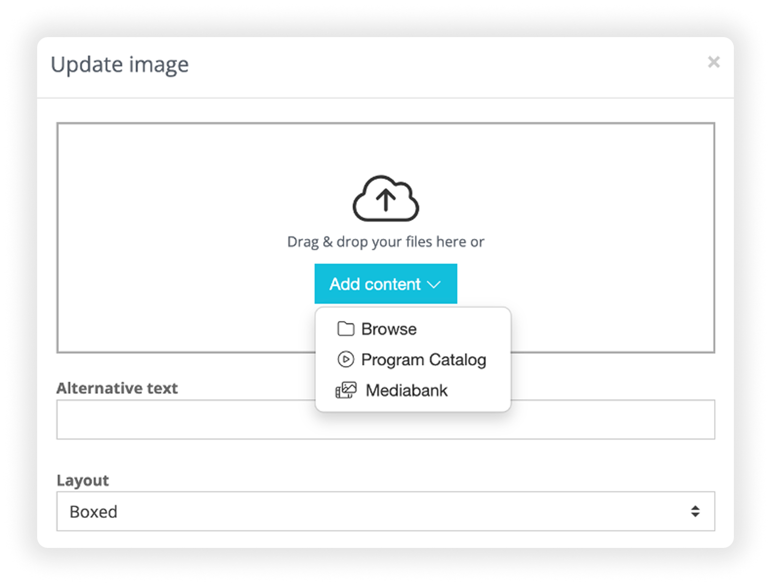
Customization Options:
Alternative text: Add optional description of the image for accessibility purposes.
Layout: Changes the way the content is presented, see example screenshots:
Full width – spans the entire page.
Boxed – fits the width of other components.
Side-by-side – image on one side, text on the other.
See display options below.
-

Full Width
Spans the entire width of the page. Optional text and button is displayed overlaid.
-
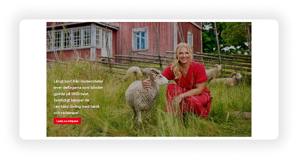
Boxed
Fits the width of other components. Optional text and button is displayed overlaid.
-

Side by side
Image on one side, text on the other. Can choose the image to be positioned the right or left.
Text on Image:
Optional, you can add header and/or body text.
In full width or boxed, the text appears on top of the image.
Side-by-side, it appears next to the image. If selected, an additional field will appear where you can choose to place the image to the left or right.
Adjust:
Text width (as a percentage of the component)
Align: alight the text to the left, center or right.
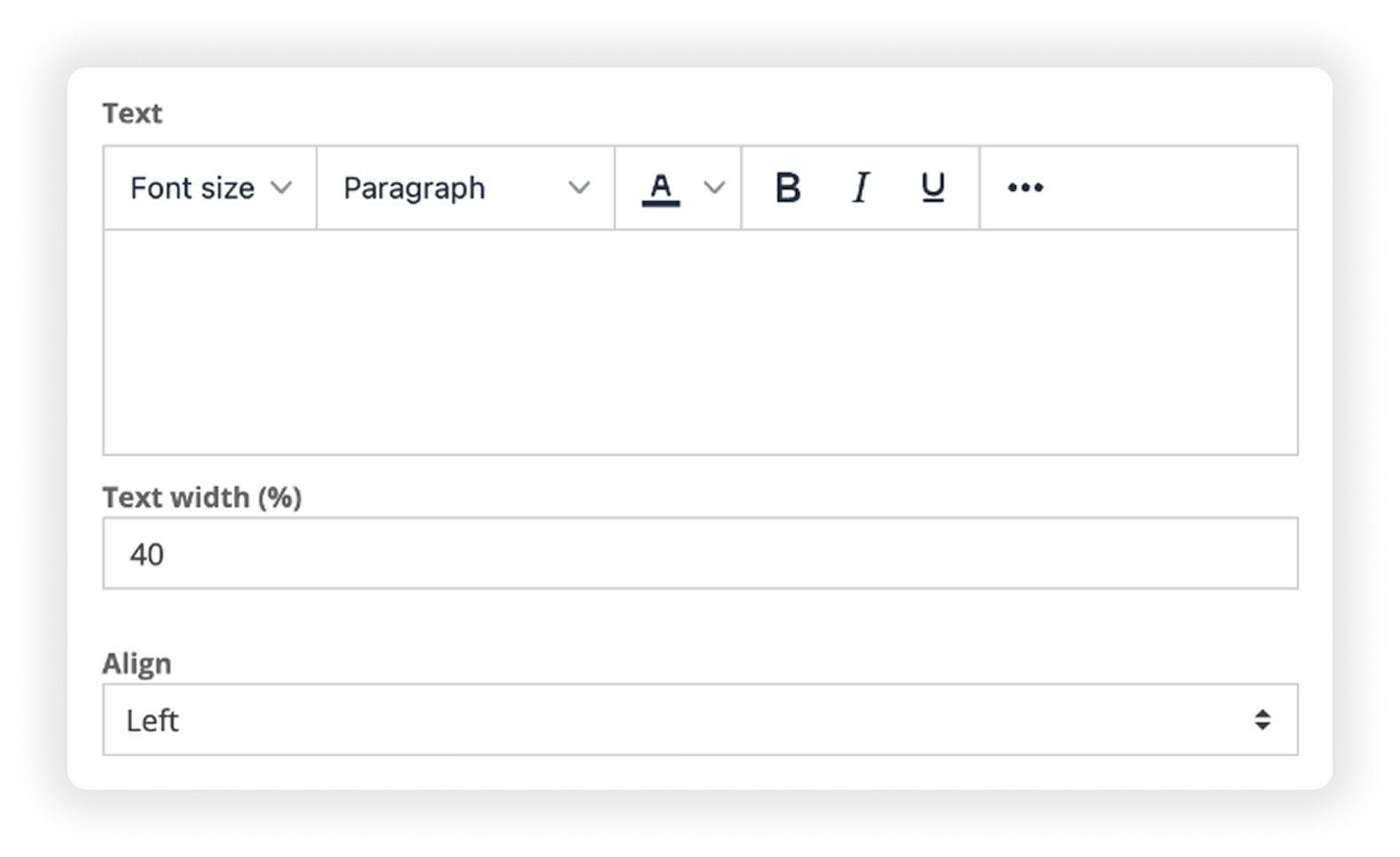
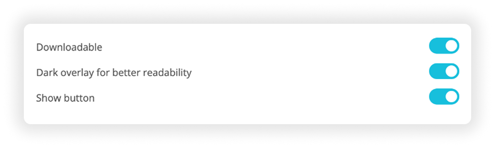
Image Presentation & Control:
Downloadable: Make image downloadable
Dark overlay for better readability: Add a dark overlay to enhance text readability
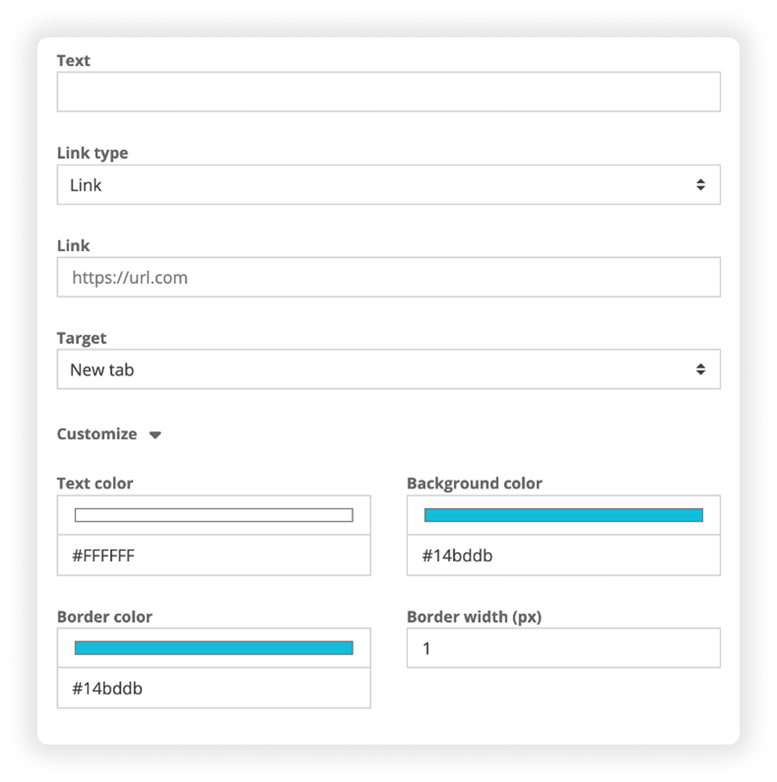
Show button: adds a clickable button under your text. You can also just add a button and no text.
Customize:
Button text
Link type: link, mail trigger, download, Media Bank collection, internal page
Target: open in same tab or new tab
Button color (will automatically use the page default style)
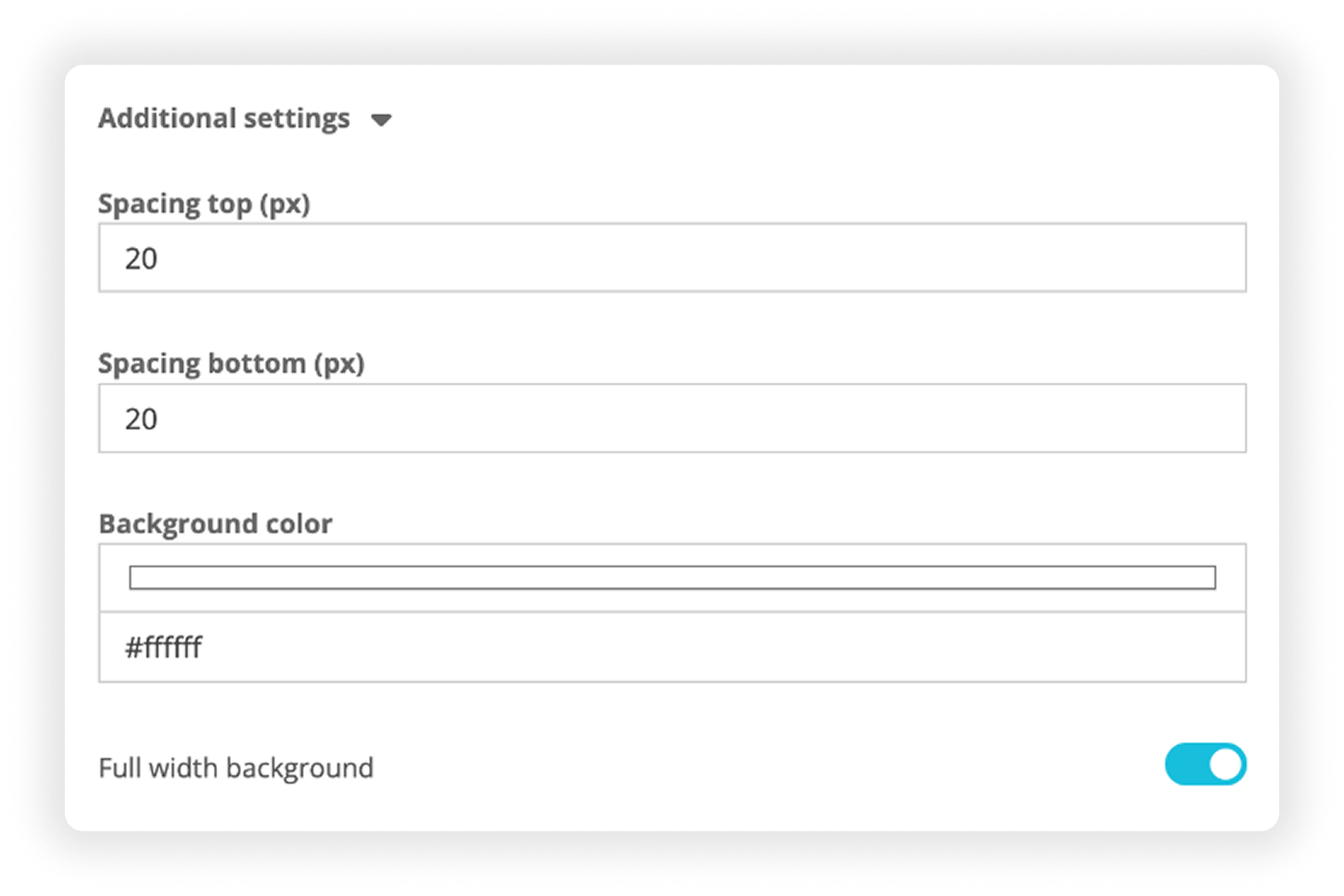
Additional Settings:
Adjust spacing on top and bottom of the component.
Change the background color and enable full-width background color.
Video
Add component ➡ Media ➡ Video
Very similar to the Image component, with a few key differences:
Uploading Options / Add Content:
Drag and drop directly from your desktop.
Browse your computer’s files.
Pull a video directly from other modules:
Media Bank
Book Catalog or Program Catalog
You can search, navigate folders, and select images easily from these modules.
Autoplay
check this option if you want the video to automatically play when the page is loaded. NOTE: audio is silenced when this is selected.


Customization Options:
Once the video is uploaded, you can choose a new thumbnail, or upload your own. You can see this in the bottom right corner of the preview (see image).

Layout: Changes the way the content is presented, see example screenshots:
Full width – spans the entire page.
Boxed – fits the width of other components.
Side-by-side – image on one side, text on the other.
-

Full Width
Spans the entire width of the page. Optional text and button is displayed overlaid.
-

Boxed
Fits the width of other components. Optional text and button is displayed overlaid.
-

Side by side
Video on one side, text on the other. Can choose the video to be positioned the right or left.
Text on Video:
Optional, you can add header and/or body text.
In full width or boxed, the text appears on top of the video.
Side-by-side, it appears next to the video. If selected, an additional field will appear where you can choose to place the image to the left or right.
Adjust:
Text width (as a percentage of the component)
Align: alight the text to the left, center or right.

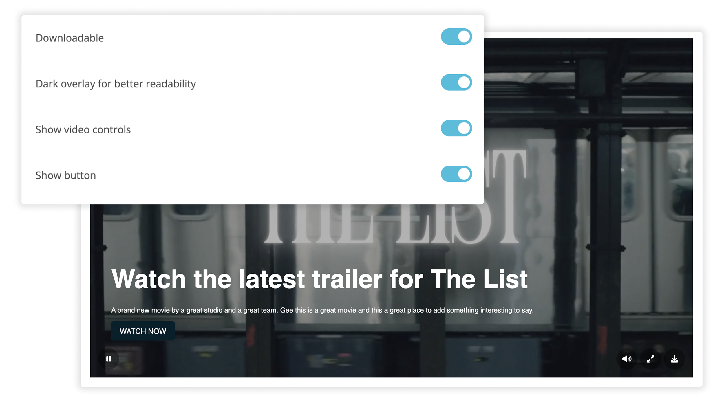
Video Presentation and Controls:
Downloadable: Make video downloadable.
Dark overlay for better readability: Add a dark overlay to enhance text readability.
Show video controls: Toggle if users can play, pause, seek within your video.
Show button: adds a clickable button under your text. You can also just add a button and no text.
Customize:
Button text
Link type: link, mail trigger, download, Media Bank collection, internal page
Target: open in same tab or new tab
Button color (will automatically use the page default style)
Additional Settings:
Adjust spacing on top and bottom of the component.
Change the background color and enable full-width background color.
Embed
Add component ➡ Media ➡ Embed
This component lets you embed content from almost anywhere.
Examples:
Video platforms: YouTube, Vimeo
Socials: Twitter/X feeds, TikTok, Instagram, etc.
Literally anything that can be embedded that you want to showcase
Custom HTML (for those who know how to code) to, for example embed two items side-by-side.
Additional Settings:
Alignment of the embed
Adjust spacing on top and bottom of the component.
Change the background color and enable full-width background color.

AUTOMATIC COMPONENTS
AUTOMATIC COMPONENTS
Automatic Components
Automatic components are dynamic blocks that automatically update based on new content added to your platform. This means you don’t have to manually update content across multiple pages — they’re constantly being crawled and refreshed.
The available automatic components vary depending on which modules you have active (e.g., Book Catalog vs Program Catalog). Below is a breakdown:
Latest Posts
Add component ➡ Automatic ➡ Latest Posts
Automatically displays your most recent press releases or posts. Customization options:
Number of Posts: Select the number of posts to display.
Layout: List, Slider, or Grid (see examples below).
Category: Filter by category (e.g., company news, sports).
Show Header: Option to enable a header and add custom header text.
Additional Settings: Adjust spacing on top and bottom of the component.

-

List
Displays content stacked on top of others, with poster image to the left and title and description to the right.
-

Slider
Displays content in a slider, with poster image on top and text underneath, in batches of three. Arrows appear on each side to easily swipe through.
-
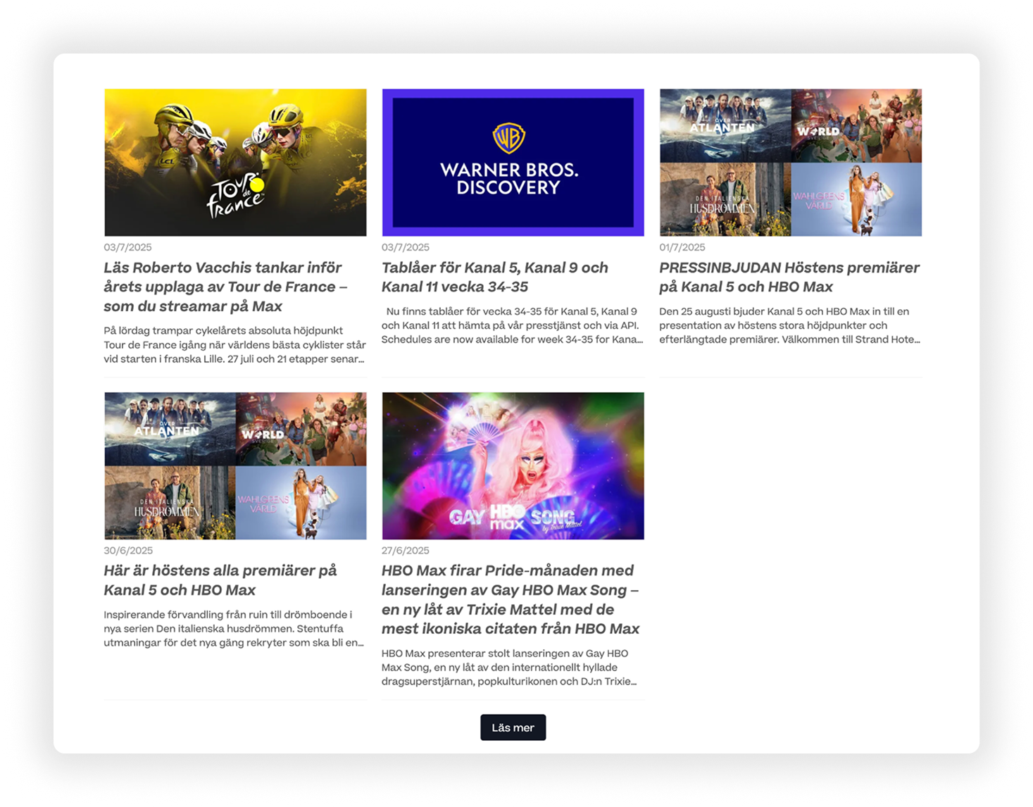
Grid
Grids content with poster image first and title and description underneath. Stacks them in columns of three.
Highlights
Add component ➡ Automatic ➡ Highlights
Displays any post that has been marked as a highlight in your Media Center. This is Ideal for featured or priority content. Automatically pulls only posts tagged as “highlighted”. Highlights are enabled individually per post, when creating them in the Media Center (see screenshot):
NOTE: You can change the expiring of highlights under each individual post when publishing in the Media Center.


Screeners
Add component ➡ Automatic ➡ Screeners
Available if you have the Screening Room module. Automatically pulls available screeners (e.g., films, episodes). You can customize:
Number of Screeners: Select the number of videos to display.
Layout: List, Slider, or Grid (see examples below).
Press Kit: Attach a press kit if one is connected to the screener.
Show Header: Option to enable a header and add custom header text.
Additional Settings: Adjust spacing on top and bottom of the component.

-

List
Displays screeners stacked on top of others, with poster image to the left and title and description to the right.
-

Slider
Displays screeners in a slider, with poster image on top and text underneath, in batches of three. Arrows appear on each side to easily swipe through.
-

Grid
Grids screeners with poster image first and title and description underneath. Stacks them in columns of three.
Press Events
Add component ➡ Automatic ➡ Press Events
Automatically displays upcoming press events. Customize:
Number of Events: Select the number of events to display.
Layout: List, Slider, or Grid (see examples).
Show Header: Option to enable a header and add custom header text.
Additional Settings: Adjust spacing on top and bottom of the component.

-

List
Displays events stacked on top of others, with poster image to the left and title and description to the right.
-
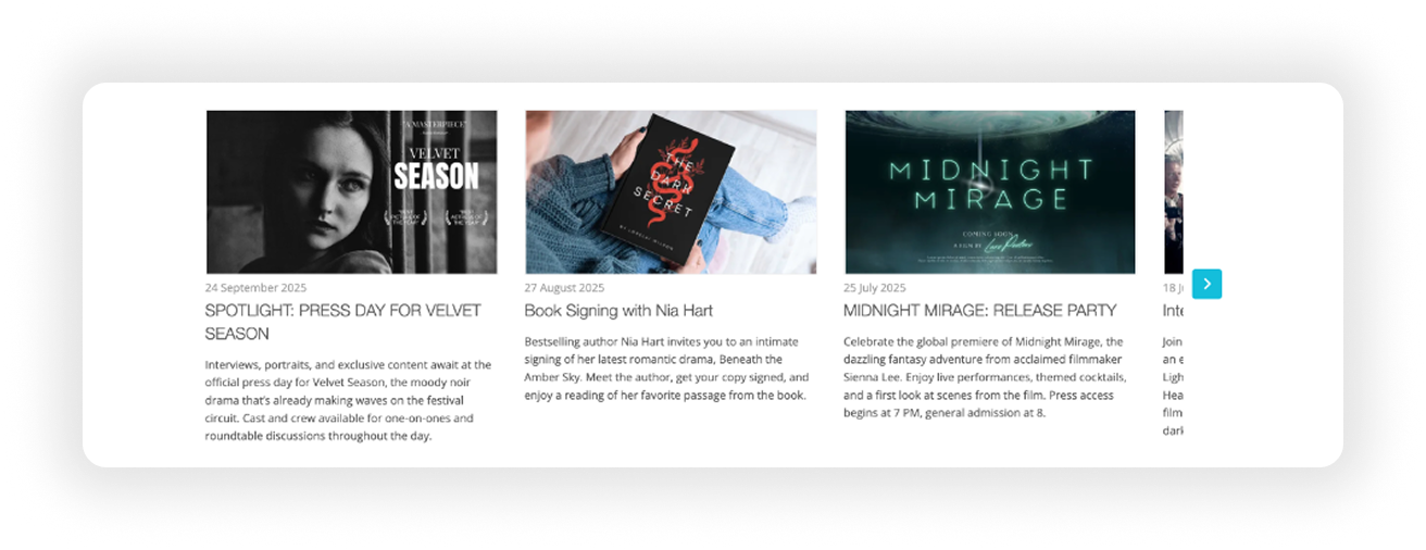
Slider
Displays events in a slider, with poster image on top and text underneath, in batches of three. Arrows appear on each side to easily swipe through.
-

Grid
Grids events with poster image first and title and description underneath. Stacks them in columns of three.
Collection
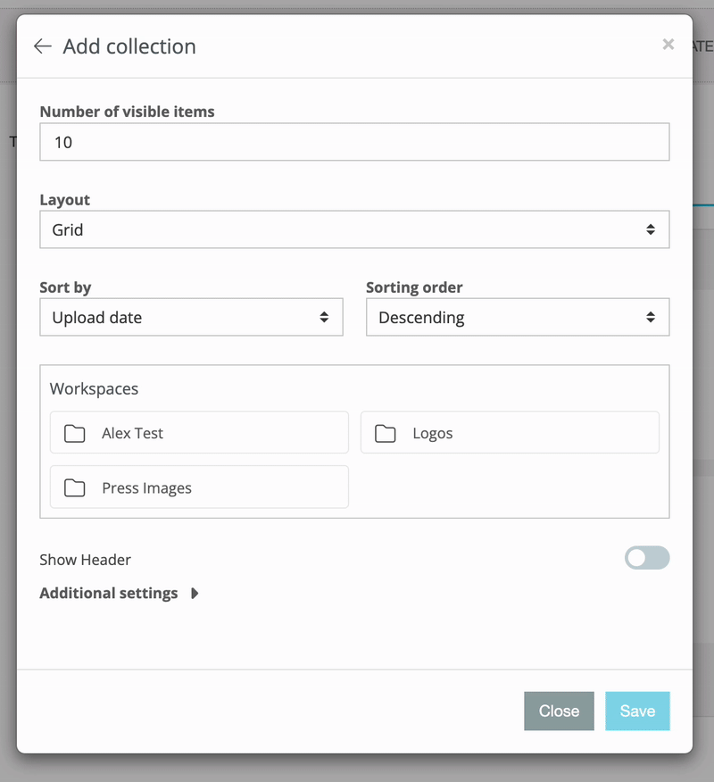
Add component ➡ Automatic ➡ Collection
Displays a folder of mixed media related to a specific topic or release. Great for promoting something like a new program or season launch. Customize:
Number of visible items: Select the number of content to display (if below fold, will show a show all button).
Layout: Only Slider, or Grid (see examples below).
Sort by: upload date or name (ascending/descending).
Sorting order: Ascending or Descending according to sort by.
Workspace: Select the folder where you want to pull the content from, and then select the check box to the right of it to populate.
Show Header: Option to enable a header and add custom header text.
Additional Settings: Adjust spacing on top and bottom of the component.
-

Slider
Displays content in a slider, with a small preview and file title underneath. Comes in batches of three. Arrows appear on each side to easily swipe through.
-

Grid
Grids content in a grid, with a small preview and file title underneath. Stacks in columns of three.
FOR BOOK / PUBLISHING CUSTOMERS
Books
Add component ➡ Automatic ➡ Books
Automatically pulls content from the Book Catalog. Customize:
Number of books: Select the number of books to display.
Layout: Only Slider or Grid (see examples).
Selection: Filter content by release type: upcoming releases, latest releases or Author (e.g., show only Astrid Lindgren titles)
Publishers: Further filter by your different publishers.
Book Format: display only a type of book(e.g., eBooks, audiobooks)
Show Header: Option to enable a header and add custom header text.
Additional Settings: Adjust spacing on top and bottom of the component.

-

Slider
Displays books in a slider, with a small preview and file title underneath. Comes in batches of three. Arrows appear on each side to easily swipe through.
-

Grid
Grids books in a grid, with a small preview and file title underneath. Stacks in columns of three.
FOR PROGRAM CATALOG USERS
Live Events
Add component ➡ Automatic ➡ Live Events
Displays upcoming live events from your Program Catalog. Customize:
Number of live events: Select the number of future live events to display.
Layout: List, Slider, or Grid (see examples below).
Program types: Filter content by type: e.g. movies, series, sports.
Channels: Further filter by your different channels.
Genres: display only a type of genre, e.g. Documentary, Drama.
Show Header: Option to enable a header and add custom header text.
Additional Settings: Adjust spacing on top and bottom of the component.

-

List
Displays events stacked on top of others, with poster image to the left and title and description to the right.
-

Slider
Displays events in a slider, with poster image on top and text underneath, in batches of three. Arrows appear on each side to easily swipe through.
-

Grid
Grids events with poster image first and title and description underneath. Stacks in columns of three.
Premieres
Add component ➡ Automatic ➡ Premieres
For customers using Schedules and/or VOD, we’re introducing a new component that automatically highlights upcoming film and season premieres, called, you guessed it, Premieres.
The system detects premieres directly from the customer’s published Schedules, meaning no extra work required. For example:
Linear premieres are identified by the premiere flag on the event.
VOD premieres are detected automatically as the first episode in a season.
The component displays key information at a glance, including poster, title, synopsis, channel/platform, and premiere date.
You can folder according to what you want to display:
Number of standalone or seasonal premieres: number of premieres you want to show
Layout: Classic Slider, Grid or List
Program types: can display All, or Seasons / Episodes / Movies, etc.
Channels: All or specific - where available
Genre: All or specific - where available
Show header: if you want to give this block a header
Additional Settings: Adjust spacing on top and bottom of the component.
